A Figma file is ready for Webflow when every frame uses auto layout, colors and type are variables, layers carry real names, and each template has desktop and mobile frames with real copy. Webflow's own Figma to Webflow plugin needs most of that before it will sync, and a developer building by hand needs the same things.
Below are the plugin's documented rules, a handoff checklist you can copy, and how a well-named file maps onto Finsweet's Client-First classes, the system I build on.
What a build-ready Figma file has
A build-ready file answers the developer's questions before they're asked. Layouts are built with auto layout, design tokens live in variables, components are real components, and nothing on a page is a guess. If you're an agency handing work to a developer, this is also what makes white-label Webflow development run without a week of questions.
In practice that means eight things:
- Auto layout on every frame that will become a section, container or card.
- A style guide page, with colors, the type scale and spacing set up as variables.
- Layer names that describe what each layer is.
- Components for anything used more than once, with every state drawn.
- A desktop frame and a phone frame for every template, plus tablet where the layout changes.
- CMS templates designed once, tested with long and short content.
- Notes on interactions and motion.
- Assets exported and fonts licensed for web use.
What Webflow's Figma plugin needs
Webflow's Figma to Webflow plugin syncs layers, variables and styles from Figma into a Webflow site. Its Help Center article sets the rules. Layers must use auto layout to sync. Variables sync one collection and one mode at a time. Variants aren't supported, custom fonts must be uploaded to Webflow first, and the plugin doesn't run in Safari.
The rules below come from Webflow's Help Center article Figma to Webflow plugin and app, last updated 24 September 2025, and from Webflow's Figma to Webflow integration page, both read on 13 October 2026. The plugin is free and published by Webflow Labs, so it changes often; check the article before you plan around it.
What the Figma to Webflow plugin supports, per Webflow's Help Center, as of 13 Oct 2026.| Figma feature | What the plugin does | What to do in the file |
|---|
| Auto layout | Required. Layers without it don't sync or paste. | Put auto layout on every frame you want built. |
| Variables | Sync to Webflow variables, one collection and one mode at a time. | Keep the base theme in one collection. Treat dark mode as a second job. |
| Text and effect styles | Become Webflow classes from the Styles tab, with an editable prefix. | Name styles the way you want the classes named. |
| Components | Syncing creates Webflow components. Pasting creates plain elements. | Sync components; don't paste them. |
| Variants | Not supported, including responsive, state and style variants. | Draw hover and active states anyway, for the developer to build. |
| Layer names | Each name becomes a class. Names such as "button", "paragraph" and "heading" also set the HTML tag. | Rename every "Frame 427" before syncing. |
| Layers under 250px wide | Can't get responsive stacking settings. | Draw the phone layout for small rows. |
| Custom fonts | Lost unless uploaded to Webflow before syncing. | Upload licensed font files to the site first. |
| Images and vector icons | Upload to the site's Assets panel. | Pick the right site in the plugin, or assets go missing. |
| Browser | Safari isn't supported. | Use Chrome or the Figma desktop app. |
The help article also says to sync "a few components or sections at a time rather than the entire page" on large pages. And when the plugin stacks a horizontal layer for smaller screens, it uses Webflow's breakpoints: tablet from 991px down to 767px, mobile landscape from 767px to 478px, and mobile portrait below 478px.
Auto layout on every frame
Auto layout is how Figma describes the box model a browser uses: direction, gap, padding, and whether a box hugs its content, fills its parent or stays fixed. A frame with auto layout translates into flexbox in Webflow almost one to one. A frame without it is a picture of a layout, and someone has to guess the rules behind it.
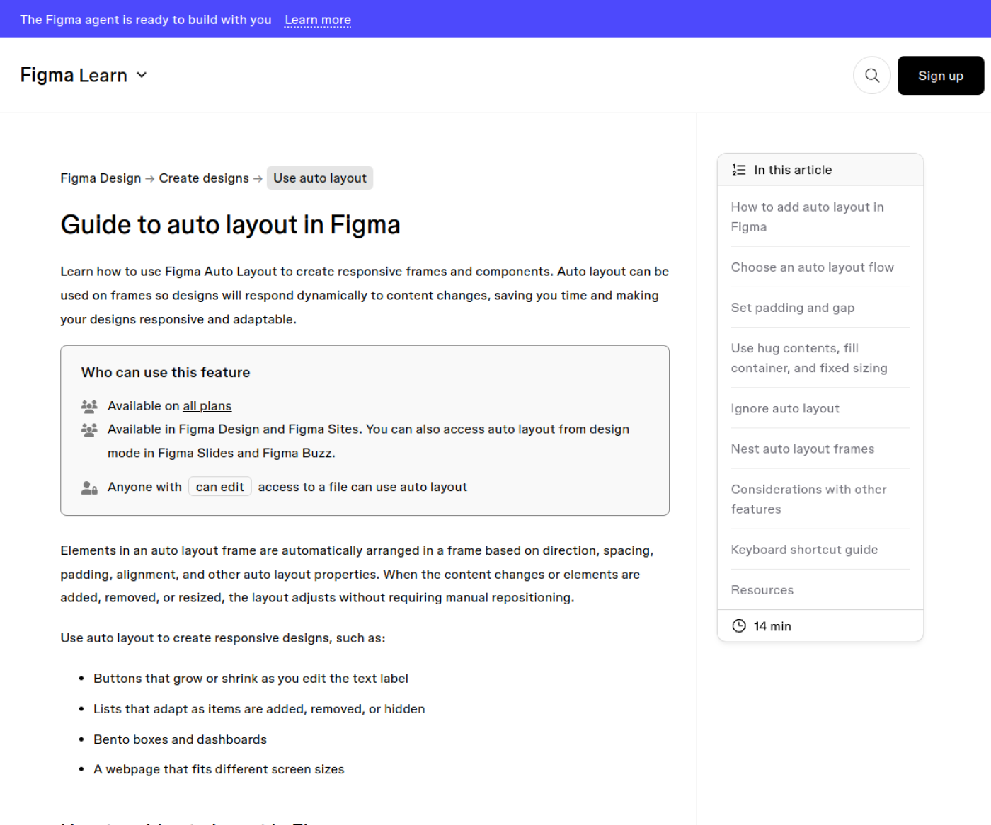
Figma's Guide to auto layout lists the settings that carry over best. Use gap instead of spacer rectangles. Use "fill container" for anything that should stretch, and "hug contents" for buttons and tags. Set min and max widths on text columns, so the developer knows where a line should stop growing.
Figma's Guide to auto layout, captured 13 Oct 2026.
Turn on "ignore auto layout" (Figma's new name for absolute position) only for things that float, such as a badge on a card corner. Every ignored layer is one the developer positions by hand at each breakpoint.
Variables for colors, type and spacing
Put every color, font size, line height and spacing value in Figma variables, and lay them out on a style guide page. Variables give the developer a list of tokens instead of a list of hex codes to collect from 40 frames. The Figma to Webflow plugin can sync them to Webflow variables, one collection and one mode at a time.
A style guide page needs four blocks: the color palette with names, the type scale from H1 to small print, the spacing steps, and the button and link styles. Name variables by role, such as "text/primary" or "background/alternate", rather than "blue-500". Role names survive a rebrand; a variable called "blue-500" that turns green doesn't.
Two limits are worth knowing. On Figma's side, extra modes, such as light and dark, need a paid or Education plan, according to Figma's guide to variables. On Webflow's side, the plugin syncs one mode at a time, and the integration page lists mode sync as not yet available.
NoteThe plugin lets you sync number variables in px, em or rem, with a base font size in its settings. Agree the unit with your developer before syncing, so type sizes don't arrive in two systems.
Layer names that become class names
The plugin turns each Figma layer name into a Webflow class, so "Frame 427" becomes a class called "Frame 427". Name layers by what they are, from the general to the specific, and the classes come out readable. If your developer builds on Client-First, naming layers in Client-First's pattern saves a rename pass on every element.
Client-First, by Finsweet, has a few rules that matter here. Each page sits inside page-wrapper and main-wrapper. Each section is section_[name], with padding-global and a container-[size] inside it. Custom classes join the group and the element with an underscore, as in team-list_headshot-wrapper. Utility classes use only dashes, like margin-large, and variations are combo classes starting with is-, such as button is-brand. The rules are in Finsweet's core structure and class strategy docs.
For a hero section, the Figma layer tree and the Webflow Navigator then match:
figma-layers-to-client-first.txtCopy section_home-hero (auto layout, vertical, fill width)
padding-global (padding left/right from a variable)
container-large (max width from a variable)
home-hero_component (auto layout, horizontal, gap 48)
home-hero_content (fill, max width 560)
heading (H1, uses the "heading/h1" text style)
paragraph (uses the "text/large" style)
home-hero_buttons (auto layout, horizontal, gap 16)
button
button is-secondary
home-hero_image-wrapper
home-hero_image
You don't have to name the outer wrappers if your developer adds them, but name everything inside the section. "home-hero_content" tells me where the element lives and what it holds. "Group 12" tells me nothing.
Components and variants: what carries over
Make a Figma component for anything that appears more than once: buttons, cards, the nav, the footer, form fields. Syncing a component through the plugin creates a Webflow component, but variants don't carry over, and Webflow's integration page says component instances aren't supported either. Draw every state anyway, so the developer can rebuild them.
For each component, put the states side by side on a components page: default, hover, focus, active, disabled, and error for form fields. A missing focus state is the one I'd ask for first, because keyboard users depend on it and it's easy to leave out.
Frames for desktop, tablet and phone
Draw every template at desktop and phone width at minimum. Add a tablet frame where the layout changes in a way a developer can't infer, such as a three-column grid becoming two columns or a nav collapsing. Webflow's main breakpoints are at 991px, 767px and 478px, so a 1440px desktop frame and a 390px phone frame cover most decisions.
The phone frame matters most for rows under 250px wide, because the plugin can't set responsive stacking on them. It also matters for anything that changes order, hides or swaps on small screens. If the phone design is "the same, stacked", say that in a note and draw one example section.
Designing CMS templates in Figma
Design each CMS template once, as a template, not as ten finished pages. Fill it with real content, then test it with a long title, a short title, a missing image and an empty optional field. Webflow fills the template from Collection fields, and the design has to survive the worst item in the Collection.
For each template, list the fields the design needs next to the frame: name, type, and a character limit where layout depends on it. That list becomes the Collection schema, and it's the right time to check it against Webflow CMS limits, such as 60 fields per Collection on non-Enterprise plans and 100 items per Collection list.
Design the list pages with the real number of items in mind too. A blog index with 12 cards in Figma will hold 100 per list in Webflow, so show where pagination or "load more" goes.
Voomo, a Webflow build I made from the client's designs, with 10,000+ CMS items and custom code. PageSpeed 92.
Copy, interactions, fonts and assets
Hand over real copy, not lorem ipsum, because headline length changes layouts. Write interaction notes beside the frames they belong to. Export images and icons in the right formats, and license fonts for web use before the build, since the plugin loses custom fonts that aren't uploaded to Webflow first.
- Copy: final or close to final in the frames. If the copy isn't written yet, my estimator adds time for "content partly ready" or "not ready", because pages built around placeholder text get rebuilt later.
- Interactions: one line per animation saying what triggers it, what moves, and how long it takes. "Cards fade up 24px on scroll, 300ms, staggered" can be built as written. "Make it feel smooth" can't.
- Images: exported at 2x the largest display size, as WebP or JPG for photos and SVG for icons and logos.
- Fonts: web licenses for every weight used, with the font files ready to upload. A desktop font license often doesn't cover use on a website.
- Links: where each button goes, including outside links and form destinations.
The handoff checklist
Copy this into the Figma file's cover page or your project tracker, and tick it off before sending the file. Every unticked line turns into a question during the build, and questions add days.
figma-to-webflow-handoff-checklist.mdCopy # Figma to Webflow handoff checklist
## Structure
[ ] Every section, container and card frame uses auto layout
[ ] Gap and padding instead of spacer rectangles
[ ] "Ignore auto layout" only on layers that float
[ ] Layers named by what they are (no "Frame 427", no "Group 12")
[ ] Client-First names if the build uses it: section_hero, hero_content
## Style guide page
[ ] Colors as variables, named by role (text/primary, background/alt)
[ ] Type scale H1 to small print as text styles or variables
[ ] Spacing steps as number variables
[ ] Button and link styles, with every state
[ ] Base theme in one variable collection (the plugin syncs one mode)
## Components
[ ] Buttons, cards, nav, footer and form fields are components
[ ] States drawn: default, hover, focus, active, disabled, error
## Frames
[ ] Desktop frame (1440px) for every template
[ ] Phone frame (390px) for every template
[ ] Tablet frame wherever the layout changes
[ ] Rows under 250px wide have their phone layout drawn
## CMS templates
[ ] Each template designed once, with real content
[ ] Tested with long title, short title, missing image, empty field
[ ] Field list next to each template: name, type, character limit
[ ] List pages show pagination or "load more"
## Content and assets
[ ] Real copy in the frames
[ ] Interaction notes: trigger, movement, duration
[ ] Images exported at 2x, WebP or JPG; icons and logos as SVG
[ ] Web font licenses for every weight; font files ready to upload
[ ] Button and form destinations listed
## Plugin (if you use it)
[ ] Custom fonts uploaded to Webflow before syncing
[ ] Chrome or the Figma desktop app, not Safari
[ ] Sync a few sections at a time on long pages
Plugin sync or hand build
Use the plugin when the file is clean and the goal is speed on simple sections, or to move variables and text styles into Webflow in one step. Build by hand when the site needs a class system that holds up over years, many interactions, or a CMS. A messy file is worse through the plugin, because every bad layer name becomes a class.
The plugin's output is only as good as the file. Even a clean sync produces one class per layer name. On a Client-First build, a developer still has to check each class against the system and swap many of them for shared utility classes. A careful developer would do that review either way, so the time the plugin saves depends on how close the file already is to the naming system.
My view: prepare the file as if it will go through the plugin, whether or not it does. The checklist above is what the plugin needs, and it's also what makes a hand build fast. Prices and timelines assume a ready file; in my estimator, as of October 2026, a 5-page Figma to Webflow build is $1,650 to $2,200 over 1 to 3 weeks, and a 10-page site with a blog is $2,700 to $3,600 over 2 to 4 weeks.
Run the checklist against your file today and note every line you can't tick. Send the file link with that list to Figma to Webflow development, and I'll reply within one business day with what needs fixing before the build and what I can handle during it.